
Craft
Project Management
Industry
eCommerce / Retail
Trolley & Order Experience Optimization
The trolley page is one of the most critical touchpoints in any ecommerce journey. Small changes here can directly influence basket size, conversion, and overall customer confidence.
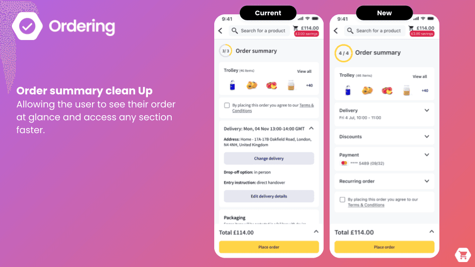
When I took ownership of the Trolley and Order domain in 2021, my focus was on simplifying the experience while making it more effective for both users and the business. Together with my team, we iterated extensively on the trolley page to surface more products upfront and significantly improve readability, helping customers understand their order at a glance.
We decluttered the experience by removing unnecessary actions and thoughtfully regrouping others within existing controls or secondary interactions. This reduced cognitive load while keeping essential functionality accessible when needed.
We also introduced selective checkout, allowing users to proceed with only the items they intended to purchase, and added a price tracker that clearly communicates progress toward minimum spend and free delivery, turning cost uncertainty into a motivating signal rather than a blocker.
Beyond the trolley, we improved the summary page by collapsing repetitive information and prioritizing what truly matters. This ensured that all key details remained above the fold, enabling users to review their order quickly without excessive scrolling.
Since my team and I took ownership of this area, the impact has been measurable and sustained:
+2% increase in basket size
+17% conversion and order placement for first-time shoppers
+9% increase in edit orders
This work reinforced how thoughtful simplification, paired with clear feedback and strong information hierarchy, can drive both better user experiences and meaningful business results.


Booking Slots: Finding the Right Order and the Right Products
Booking a delivery slot is one of the most critical steps in the ecommerce journey, not just for customers, but for retailers as well. For users, it defines when and how they’ll receive their order. For retailers, it directly impacts stock management, routing efficiency, and operational cost.
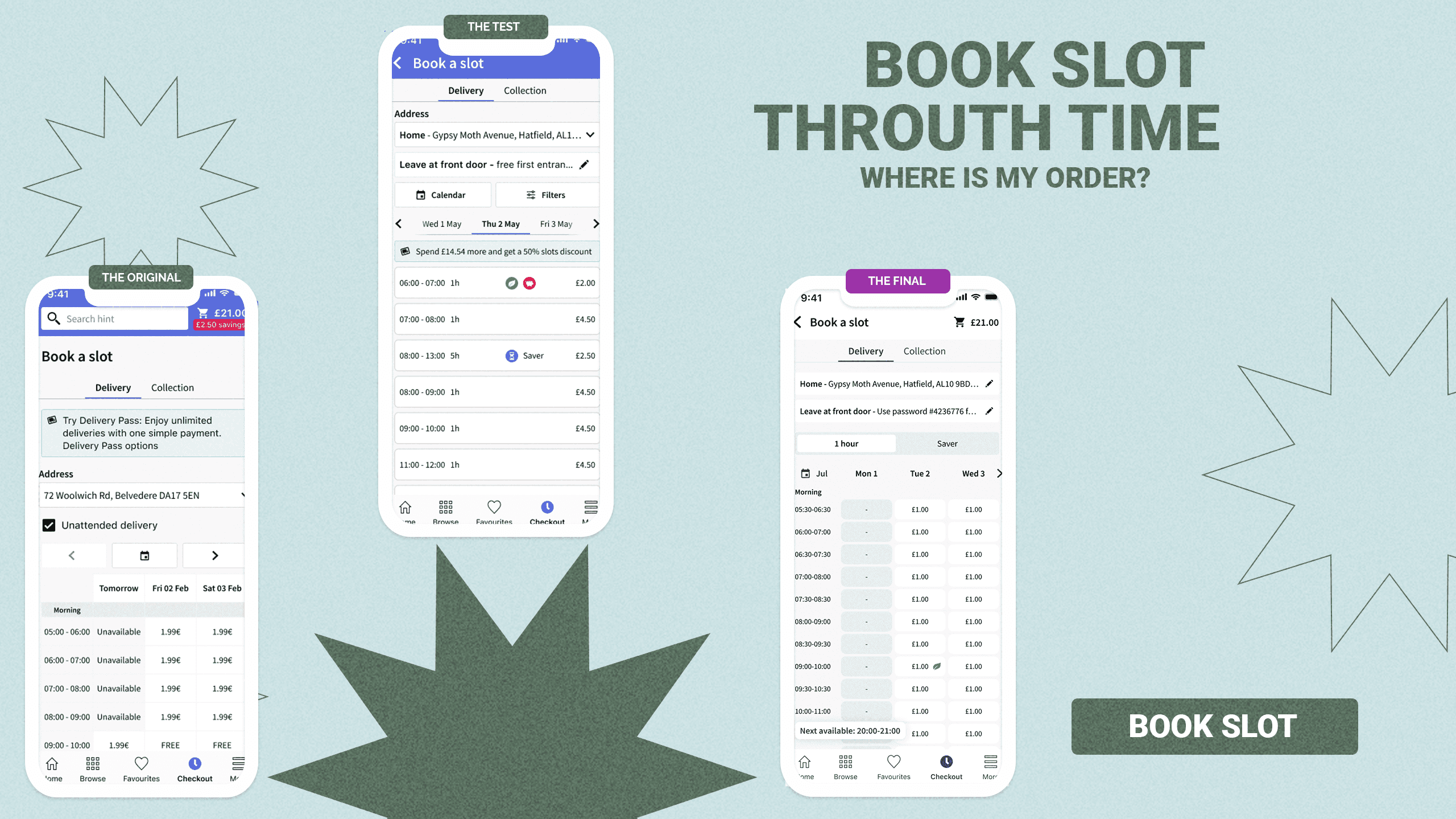
With that balance in mind, my team and I approached the delivery slot experience as a system, not just a screen. We iterated across every major dimension of the slot selection flow, testing multiple models including infinite scroll, single-day views, three-day ranges, extended multi-day options, and grid-based layouts. Each variation was validated through qualitative research and A/B testing to understand both performance and user confidence.
Data showed that 79% of users book a delivery slot within the next three days. Showing more options beyond that window added complexity without improving conversion. The three-day grid consistently performed best, offering enough choice while keeping the experience fast and focused.
We also discovered that users are open to longer delivery windows, as long as they feel in control of that decision. Longer slots benefit retailers by enabling more flexible routing and better resource allocation, but they come with a challenge: managing delivery expectations.
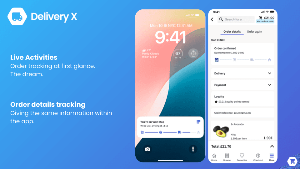
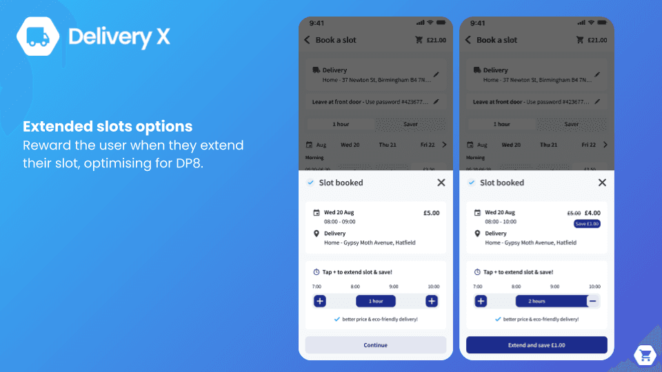
To address this, we introduced live activity tracking to keep users informed in real time, and began exploring a gamified experience that allows users to extend their slot window voluntarily (currently work in progress). This helped shift longer delivery windows from a compromise into a conscious, empowered choice.
Since taking ownership of the Delivery Experience, the impact has been clear:
+23% increase in slot bookings
−3% reduction in operational costs through longer delivery windows
+11% improvement in deliveries per minute
This work demonstrated how aligning user trust with operational flexibility can unlock value on both sides—driving conversion while improving efficiency at scale.
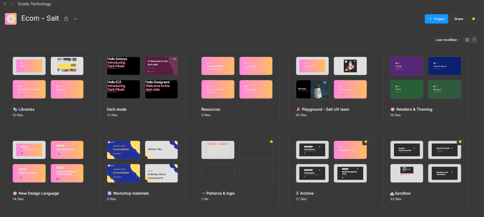
From Chaos to System - Design System
When I joined Ocado, there was no functional design system in place. To keep some level of consistency, I had to create my own fragmented, improvised, and supported by external tools. At the time, we were working primarily with Illustrator and Photoshop, which made maintaining alignment and scalability extremely difficult.
Sketch came later, and with the introduction of Abstract we gained some much-needed coherence. Still, it wasn’t until I proposed and helped drive the migration to Figma that a true design system began to take shape.
Over the years, I’ve watched the Salt Design System evolve from a collection of atomic elements into a full-fledged platform. Today, it doesn’t just connect designers and engineers, it acts as a shared language across teams and partners, enabling consistent theming, coherence at scale, and a level of flexibility I wouldn’t have imagined in its early days.
One of the most rewarding outcomes of this evolution is how it’s changed the way we work. Design reviews are no longer about introducing undocumented, one-off components. Instead, they’ve become healthy, collaborative discussions with the Design System team about how the system should grow, adapt, and improve together.
We are now finally implementing onf of my long term dream/wishes, which is no other than Dark Mode!


Ratings Follow Actions
I see myself as a native mobile product leader. I led the Android redesign, drove the cleanup and unification of iOS assets, and consistently advocated for a mobile-first mindset across teams and partners.
I also know (better than most) that users don’t like change. Over a 10-year span, we launched multiple retailers and partners: some with no previous digital experience, and others migrating from their own platforms to our OSP solution. Each launch brought its own challenges, expectations, and resistance to change.
During that journey, we experienced fluctuations in both Google Play and Apple App Store ratings. At times, those scores could weigh on team morale, even when the underlying work was solid and necessary.
That’s why seeing today’s ratings, after years of thoughtful iteration, platform evolution, and hard work, makes me especially proud. They’re not just numbers, they’re proof that when change is handled with care, consistency, and a user-first mindset, trust follows.
